Why COVID-19 Case Numbers Lack Value
Even though I have explained why I don't focus on cases, I still get a lot of queries about them, which is not surprising since that's all the media focuses on, with no perspective or analysis of course.
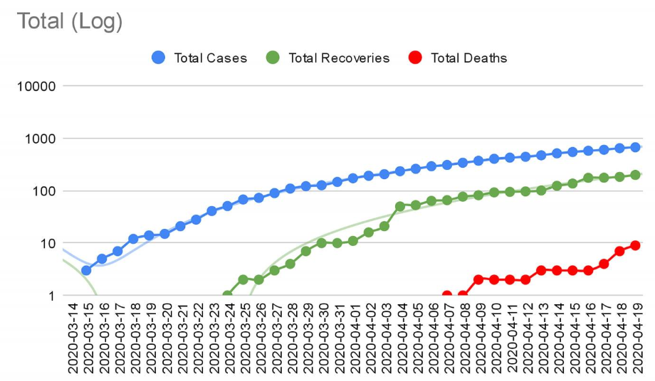
Have a look at this plotted data using a logarithmic scale (exponential growth) rather than linear, as that's the proper way to assess and visualize the growth. As a disease progresses, you expect to see the number of new cases grow exponentially before coming down. The fact we keep seeing a range of 20-40 cases daily and not seeing 100+ new cases daily is very encouraging. As you can see, the curve is very flat. For example, once we reported our first case back on March 15, it took just 3 days for that number to multiply by an order of magnitude aka exponentially (10 cases), and then about 10 days for it to reach another order of magnitude (100 cases). Now, 23 days later and we are only 72% of the way to the next order of magnitude (1000 cases). This very flat and slow logarithmic growth, resulting from growth that has been consistently linear each day, is very very very good news, especially considering the issue we have in LTC facilities. Northwood alone accounts for 21% of all NS cases and 56% of all NS deaths.
Note this is all completely ignoring all the issues with case data that has been previously discussed at length (lack of consistency is testing quantity and criteria). The absolute number of cases is far less important than the growth. For example, if each day the number of cases went up by 1 (41 one day, then 42 the next etc...), the media would report record breaking number of cases each day, but in fact that would be quite good news for a while, as it would actually mean the rate of growth is slowing each day, which is precisely what's happening.