inFACT COVID-19 Visuals - Part 2
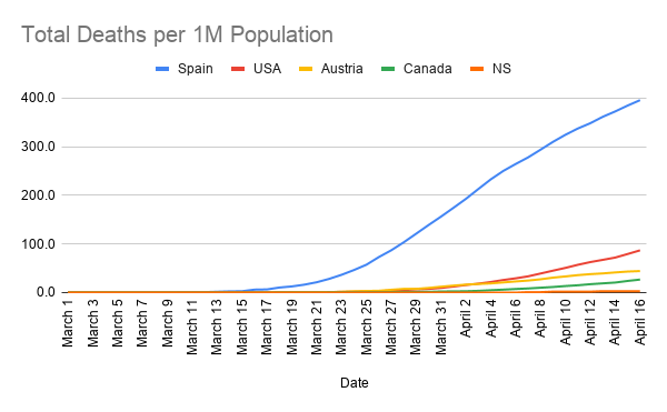
This one is more straight forward. As the title states, this one measures the total, cumulative deaths per 1M population over time. This is the data used to calculate the change that's plotted in Part 1. As the graph in Part 1 approaches 0, ie: the increase in death slows until it reaches 0 new deaths, this graph will continue to rise, but at a more gradual rate, until it plateau's to the point of being horizontal. When it's horizontal, it means the death rate is no longer increasing because there are no new deaths and the curve is then flat.
The expression "flatten the curve" literally means to slow the rate of increase. As you can see, compared to a hard hit country like Spain, the curve in the US and Canada are already quite flat and gradual, Austria is near totally flat and NS has no curve at all