inFACT COVID-19 Visuals - Part 1
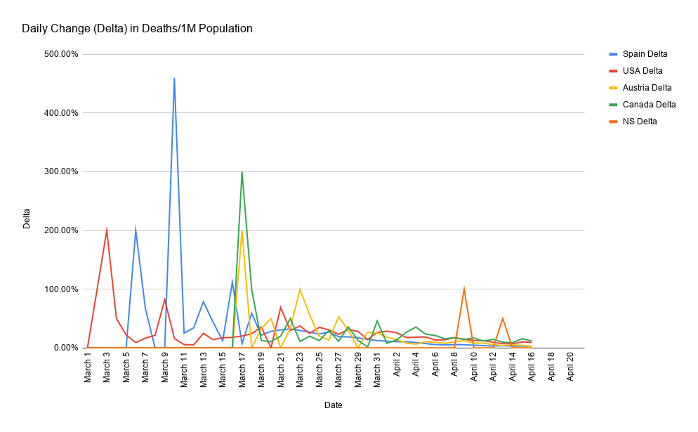
Daily Change in Total Deaths per 1M Population
This graph represents the CHANGE in TOTAL (cumulative) death rate from one day to the next. The natural occurrence for this type of data is for it to spike earlier on when the numbers are smaller and therefore more volatile. For example, the difference between 2 and 4 is 100% (aka double) but the difference between 1000 and 1100 is only 10%. In this example, we would be pleased to see the 10% even though the 100 additional deaths is far greater than 2, but because the 2 was early on, it still represented a doubling of the death rate and progression of the virus, when what we want to see is the number approaching 0%
In Layman terms, this isn't about the absolute death numbers, this is about statistical trends. More people dying today vs a day last week doesn't automatically mean today is worse (remember, big picture thinking). As the virus progresses and there are more and more cases, more deaths are inevitable. What provides good news, is when we see the rate of increase slow down, ie: increase at a decreasing rate. For example, if the death rate per 1M on date 1 is 100 and date 2 is 105, that is a 5% increase. If the death rate on date 3 is 109, that is just 3.8% higher than date 2. So whilst still increasing (as of course it will until there are 0 new deaths), the rate of increase is slowing and that is precisely what we want to see
Happy to answer any questions as I know this can get a bit technical. The conclusion based on current date is that Spain and Austria are on a clear and consistent decline. Canada and the US are also heading in the right direction but it's not quite as consistent just yet. The next few days will paint a more clear picture of exactly where we are. NS specifically, with only 3 deaths doesn't offer much on the trend line other than to simply state, things are going very well with limited death and hospitalization.