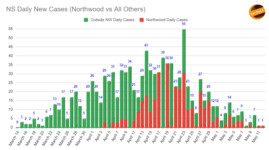
New Visual - NS Daily New Cases
I sent this one out yesterday for the first time, but I had a couple requests to break it up. So here it is again, broken down between Northwood daily cases and all other daily cases. Just gives a nice visual representation of where the cases are coming from each day. For the same reasons as described before, this graph will also always be a day behind, otherwise it will always show the current day as 100% outside Northwood. Going forward, I will send this one out with the bar graph update once Northwood updates their data each day.