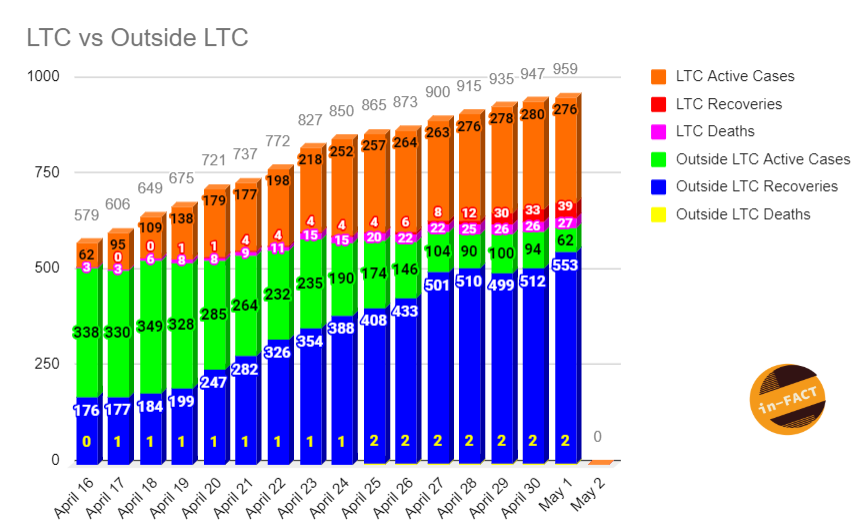
Brand new COVID-19 Visual - NS LTC vs Outside LTC
Whilst awaiting for the Government to update NS figures today (not sure why so late), I have put together some data and created a visual so you can see the difference between what's happening within LTC, and what's happening outside LTC.
See the attached visual, I will update this daily but after today, won't send it out until after Northwood updates their figures which is usually well after the NS Goverment update is posted. This will ensure the data isn't always a day behind. I will continue to send out my regular update asap once the government update is available, and then send this one separately later in the day.
Things of note:
- Each bar, represents a day, and is TOTAL Cases
- Each colour within each bar (day) represents a portion of total cases, as indicated by the legend
- Data begins on April 16 as that's when the government updates began including LTC data
- April 29 is when Northwood began reporting staff recoveries so you see a small spike in LTC recoveries that day
- The numbers are the very top are total cases each day, the rest of the numbers correspond with each case element in the legend
Key trends to note:
- LTC Active Cases (orange) has been steadily encompassing a larger portion of total cases each day
- Conversely, outside LTC active cases (green) has been a smaller and smaller portion of total cases each day, as of yesterday the estimate is just 62 active cases outside LTC
- As the blue bar pushes up against the green more and more, you really can visually see how recoveries have really grown and active cases fallen drastically outside LTC
Any questions or anything that you'd life clarification on, please just ask!